User Testing

Process

We didn't start from scratch
(back to process overview)

Fortunately, a previous team had already started to explore what a real-time air quality user interface might look like. Here's a look at some of the prior art we started with.

Talking to real users
(back to process overview)

Wizard of Oz testing is one of the most powerful UX design techniques I've encountered. It doesn't hurt that it's also super fun. The basic idea is that you can rapidly prototype many different things if you use yourself to fill in the gaps in functionality that a complete design would have. In the case of basic UI design, this looks like some paper wireframes that you manipulate as your users touch parts of the screen. However, you can quickly increase the complexity by using sticky notes and clear sheets to mimic things like dropdowns and modals. Since everything is on paper, edits and re-designs can be immediately co-created with users.

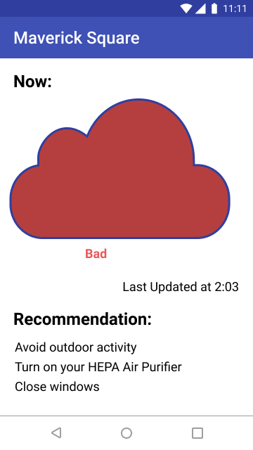
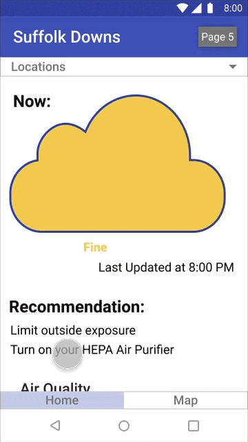
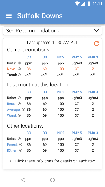
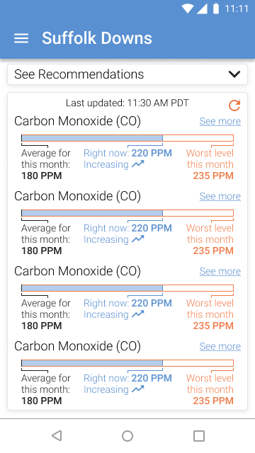
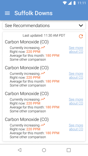
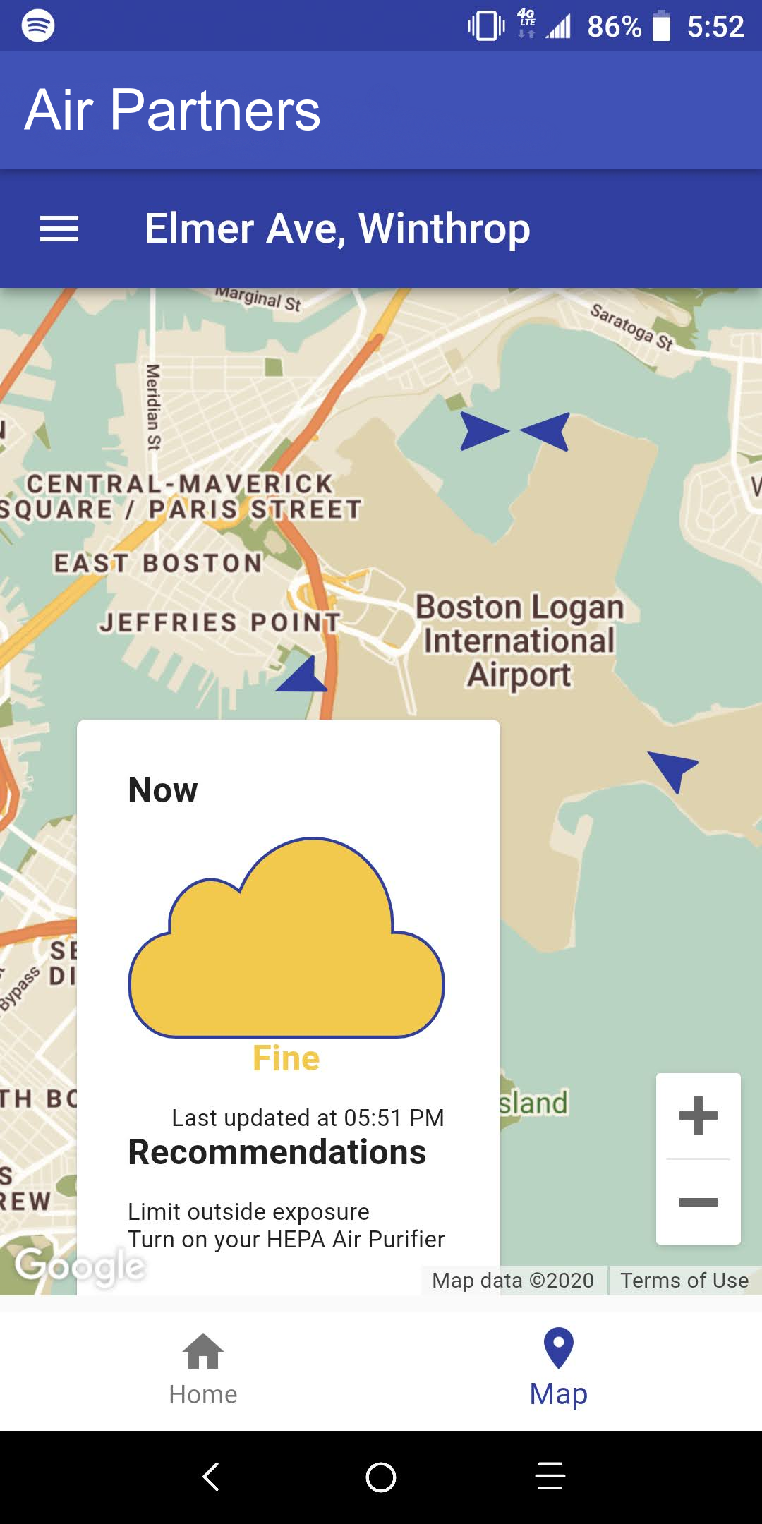
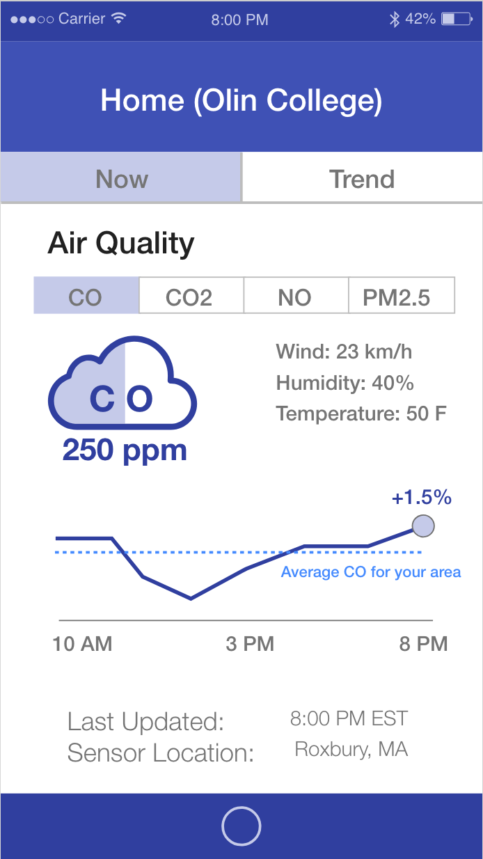
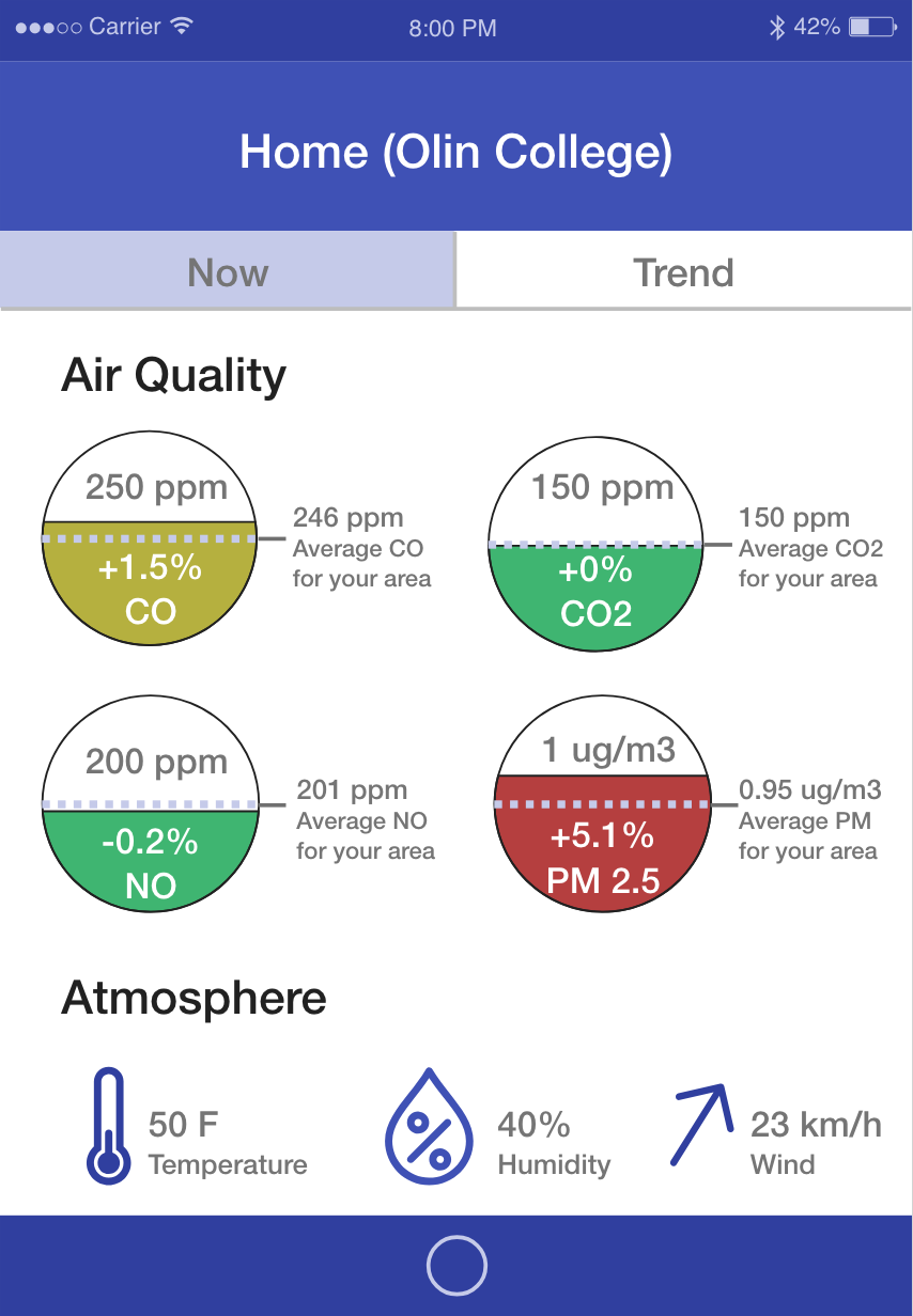
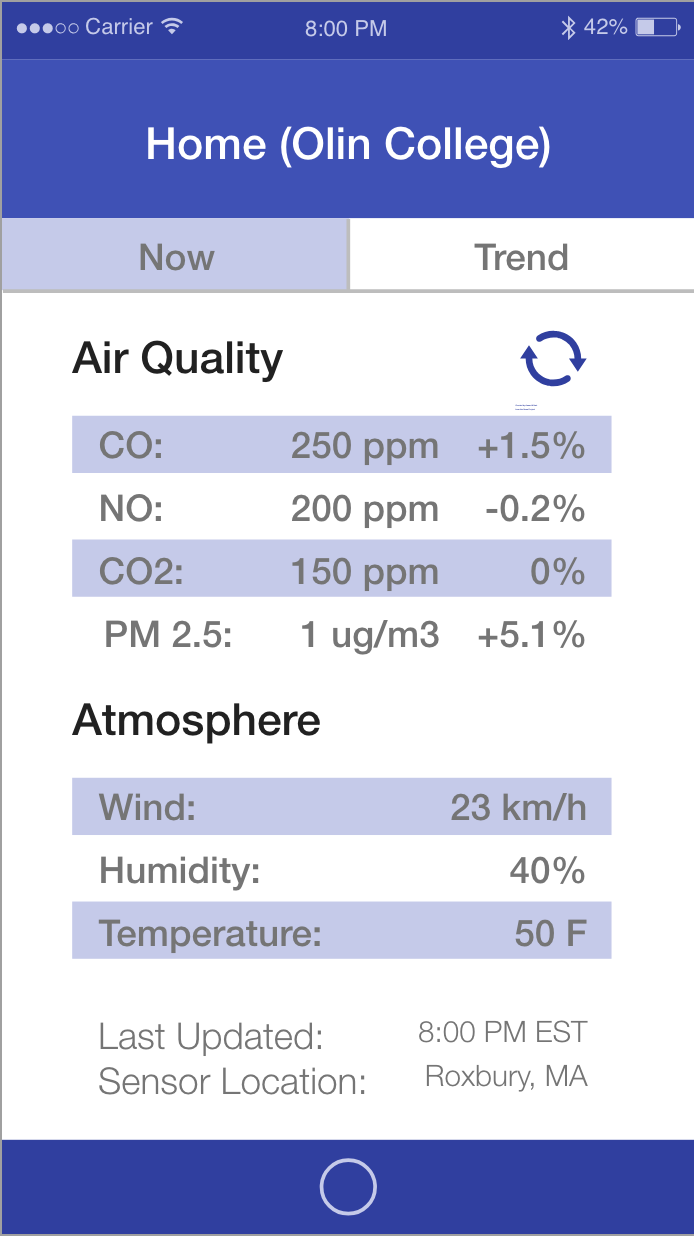
Before making a bunch of blind changes to our UI, we needed to get input from users. We wanted to utilize these existing wireframes as a platform for understanding how our users would interact with real-time air quality data. We, of course, interviewed them to understand them as people and their conceptions of air quality better before showing them the wireframes. Before heading out, we hypothesized that some users may be overwhelmed by looking at any data. Therefore, we quickly mocked this additional view (just as an experiment) to give clear actionable information without any data.

What we learned:
  • Most users were overwhelmed by the views with numbers and graphs; although, some had a desire to learn how to interpret them.
  • Everyone had a strong desire for recommendations about what to do.
  • Many people reacted well to the at-a-glance view but at least one person felt more sure seeing the numbers.

An unfortunate opportunity to try something new
(back to process overview)

Due to COVID-19, we were forced to take our remaining planned user interactions virtual. We have very strong partners in this work in East Boston. Some of the big ones are Mothers Out Front and AIR, Inc, which are both activist organizations fighting the big polluters in their communities. We were fortunate to get the chance to do Zoom calls with members of each organization in which we were able to interview them and then watch (and record) them interacting with the prototype. We quickly converted our designs into a fully-automated standalone UI wireframe in Figma for this remote user testing.

Design insights:
  • These more knowledgeable users were still interested in basic information for immediate decision-making, like whether pollutant concentrations are increasing or decreasing.
  • There is a desire to implicate sources with the data to serve activist work. However, the features it would require are beyond our scope and this work is better served by historical data analysis.
  • The app needs to have an educational mindset; in particular, people want to know what levels are healthy and from where pollution is coming.

Virtual user testing was really interesting and it's something I'm interested in continuing to explore! Althouogh we were skeptical of it at first, there are always silver linings. Here are some of the pros and cons from our experience.

Pros:
  • Screen-sharing eliminates having to watch over a user's shoulder or observe the prototype upside down from across a table.
  • Recording is easy and not a weird ask. Plus, people can easily turn video sharing off.
  • It's way easier to schedule virtual testing.
Cons:
  • It's not accessible to people technological limitations (wifi speed, computer access, comfort using desktop and web applications).
  • It's harder to reach people outside your existing network. In person introductions are much more effective.
  • It's harder to get a user group together and bang out back-to-back tests.

Nailing down requirements
(back to process overview)

After all this user testing, it was critical to develop personas to solidify the user stories we heard. From these three personas, we were able to develop a set of requirements for a first release of our real-time air quality data platform:

  • An at-a-glance view with, at minimum, information on how levels have been changing in a recent time period (exact time period to be determined from further data analysis) and recommendations for mitigating exposure to pollutants
  • Obvious communication of most recent data timestamp and method for manually refreshing the view
  • Current pollutant levels compared to one or a combination of the following: local averages, health standards, understandable comparisons (e.g. a forest).
  • A map view which incorporates wind direction and ideally incorporates the at-a-glance view
  • Clear ways to access educational information about sources, impacts, and health standards
DREW

Drew has kids and, unsurprisingly, constantly has to make decisions to keep them healthy and happy. Drew says they need air quality data most in the summer, when their kids want to play outside every day. Drew knows air quality is a problem, like everyone in East Boston, but they don't know much about air quality and don't have the time or desire to get into it. They just want to see actionable information to help them make decisions.

Key needs:
  • Comparison of current data to understandable references.
  • Clear and actionable recommendations.
TAYLOR

Like Drew, Taylor probably has kids although they might just work with kids as a teacher or coach. Taylor wants to dive deeper into the air quality problem in East Boston but doesn't know where to start and can get overwhelmed from just looking at data. Taylor needs recommendations to protect themself and their kids but wants to be confident in the reasoning behind them. However, Taylor feels confident knowing that, regardless of how well they understand the data, at least they can avoid going outside when levels are increasing or worse than usual.

Key needs:
  • Educational aspects about sources, health impacts, and healthy standards
  • Indications of averages and the trend of current levels (is it getting worse or better)
ALEX

Alex loves data. Alex has probably lived in East Boston for a long time and is frustrated by the air quality problem. Alex wants to use the data to understand trends, sources, and implicate big polluters. Alex may have kids but they're probably old enough to be taking care of themselves. Alex is pretty good with technology and picks things up quickly.

Key needs:
  • High spatial and temporal density data
  • A map view to relate local data trends to big polluters and wind direction

Redesign

Since developing our requirements, we've put most design work on hold while we build the back-end to serve data to our application and create a front-end framework which can be easily updated and tested with the first release design. That being said, we have done some preliminary design work to explore potential directions for our redesign.

At-A-Glance

In all these at-a-glance mockups, you'll notice the information hierarchy. The recommendations are the first things our users will be looking for, but they take up a lot of space on the page. We could hide the data initially and let users expand it but the purpose of this whole project is to provide an intuitive platform for interacting with the data. Therefore, recommendations are collapsed initially but shown at the top of the screen with an expansion arrow as a clear affordance to access them. Additionally, the last updated time and a refresh button sit at the top of the data section to provide context and control for immediate decision making.

Map View

Our map view has actually made it all the way to implementation and you can see a screenshot of our mobile app here. The overall design isn't final; there are a lot of details to iron out. But this is a looks-like feels-like prototype for testing our backend.

Features:
  • Easily visible wind direction indicators
  • At-a-glance (prior design for testing) overlay on sensor location click
  • User location (not displayed here since I was in CA when I took the screenshot)